
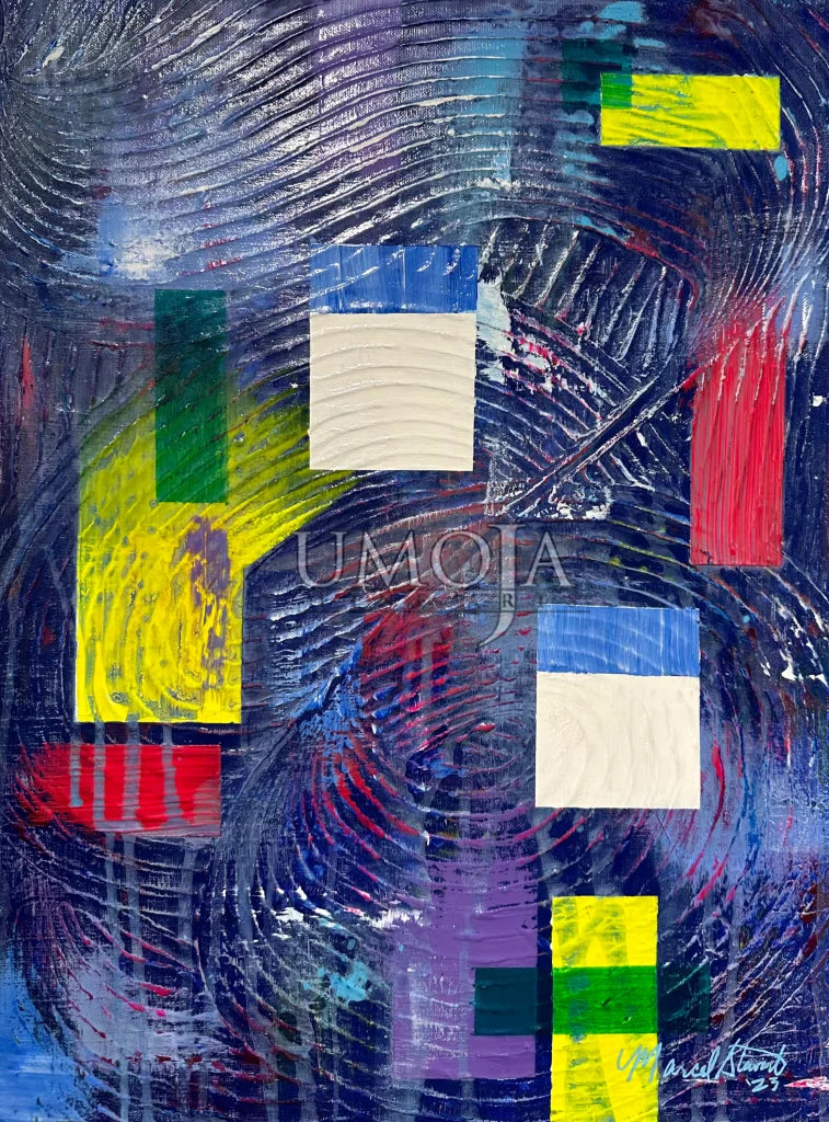
Organized Tranquility
“It’s All About Color” Series
Acrylic on Canvas - Original
18"x24"
Organized Tranquility evoke a sense of calm and peace. The concept of tranquility is often associated with serenity, inner peace, and a state of relaxation. When we think of shades that represent tranquility, we envision colors that are soothing and harmonious. Here are a few examples:
1. Soft Blue: Light shades of blue, such as baby blue or sky blue, are commonly associated with calmness and tranquility. These hues can remind us of clear skies or calm ocean waters.
2. Pale Green: Light and muted greens, like mint or sage, can create a tranquil atmosphere. These shades are often associated with nature and evoke a sense of balance and harmony.
3. Lavender: The soft and gentle tones of lavender can bring a sense of tranquility. This color is often linked to relaxation and promotes a serene environment.
4. Pale Pink: Light pinks, such as blush or pastel pink, can create a calming effect. These shades are often associated with innocence and create a soothing atmosphere.
5. Cool Gray: Soft shades of gray, such as dove gray or silver, can convey a tranquil ambiance. These colors are neutral and can help create a sense of calmness and balance.
These are just a few examples of shades that can evoke a feeling of tranquility. Ultimately, the choice of colors to create a serene environment depends on personal preferences and the specific atmosphere you want to achieve.
